shadcn-svelte in SvelteKit: setup, theming, and components
- Published
On this page
- What shadcn-svelte is (and what it isn't)
- Adding shadcn-svelte to a SvelteKit project
- Setting up Tailwind 4
- Theming shadcn-svelte with CSS variables
- Dark mode without the flash
- The components you'll actually use
- Building forms with Superforms
- Is shadcn-svelte compatible with Svelte 5?
- Common pitfalls
- Is shadcn-svelte right for you?
- Wrapping up
shadcn-svelte gives you components you own: you copy them into your project, then change anything you want. There's no package exporting black-box components, and the code lands in your repo and bends to you.
This guide sets it up in a fresh SvelteKit 2 app (Svelte 5 and Tailwind 4, current in 2026), then builds a small projects dashboard: a sidebar shell, a sortable data table, a dialog form, and dark mode. If you've heard shadcn-svelte isn't Svelte 5 ready, that's outdated. The current version is runes-native.
What shadcn-svelte is (and what it isn't)
shadcn-svelte is a community port of shadcn/ui for Svelte, built on Bits UI for behavior and Tailwind for styling. The pitch in one line: it is not a component library, it is how you build your own.
When you add a component, the CLI copies its source into your project. You edit the button by editing the button, not by wrapping it or overriding its styles from the outside. That is the whole model, and a real fork in the road.
The split underneath is worth knowing. Bits UI provides the unstyled, accessible behavior (focus management, keyboard handling, ARIA wiring), and shadcn-svelte layers Tailwind styling on top. You get accessibility you did not have to write, and styling you can rewrite, with no component version to stay pinned to.
If you want components you can read, fork, and reshape, this is the right tool. If you want something you `npm update` and forget about, look at Flowbite or Skeleton instead (more on when to choose which at the end).
Adding shadcn-svelte to a SvelteKit project
Start with a fresh SvelteKit project. The Svelte CLI scaffolds it and wires up Tailwind in a single step:
bunx sv create my-app --template minimal --types ts --add tailwindcss
cd my-app
Then initialize shadcn-svelte:
bunx shadcn-svelte@latest init
The init asks you to pick a design-system preset (Vega is the classic shadcn/ui look), then writes a components.json that records your import aliases, base color, and registry. With that in place, add components by name:
bunx shadcn-svelte@latest add button sidebar dialog table
Each one lands under $lib/components/ui. Import and use it like any local component:
<script lang="ts">
	import { Button } from '$lib/components/ui/button/index.js';
</script>

<Button>Click me</Button>
Here's the components.json a fresh init writes:
{
	"$schema": "https://shadcn-svelte.com/schema.json",
	"tailwind": { "css": "src/routes/layout.css", "baseColor": "neutral" },
	"aliases": {
		"components": "$lib/components",
		"ui": "$lib/components/ui",
		"utils": "$lib/utils",
		"hooks": "$lib/hooks",
		"lib": "$lib"
	},
	"typescript": true,
	"registry": "https://shadcn-svelte.com/registry",
	"style": "vega",
	"iconLibrary": "lucide"
}
`components.json` is the contract: it remembers your aliases and base color so every `add` drops files in the right place, already styled to match.
Setting up Tailwind 4
shadcn-svelte targets Tailwind 4, which moved configuration out of tailwind.config.js and into your CSS. The --add tailwindcss step already did this. Your global stylesheet (src/routes/layout.css in a fresh project) starts like this:
@import 'tailwindcss';
@import 'tw-animate-css';
@import 'shadcn-svelte/tailwind.css';

@custom-variant dark (&:is(.dark *));
Three things changed from Tailwind 3. There is no JS config file. Animations come from tw-animate-css (it replaced tailwindcss-animate). And dark mode is declared with @custom-variant. That one line is what makes dark: utilities respond to a .dark class on the <html> element.
If a shadcn-svelte tutorial has you editing `tailwind.config.js`, it is out of date. Tailwind 4 config lives in CSS now.
Theming shadcn-svelte with CSS variables
Your colors are CSS custom properties, defined once for light and once for dark. shadcn-svelte uses oklch values, which keep lightness perceptually even across hues:
:root {
	--background: oklch(1 0 0);
	--foreground: oklch(0.145 0 0);
	--primary: oklch(0.205 0 0);
	/* ...the rest of the tokens */
}

.dark {
	--background: oklch(0.145 0 0);
	--foreground: oklch(0.985 0 0);
	--primary: oklch(0.922 0 0);
}
Components reference these tokens (bg-background, text-foreground, bg-primary), so rebranding the whole UI means changing the variables, not the components. Want a blue primary? Set --primary to a blue oklch value in both blocks and every button, badge, and focus ring follows.
The preset you picked at init is just a starting set of these tokens. shadcn-svelte ships several palettes, and the theming docs cover swapping or extending them.
Theme once, at the token layer. Never reach into individual components to recolor them.
Dark mode without the flash
Dark mode is the part most setups get subtly wrong. The naive version reads the saved theme in onMount, which runs after hydration, so the page paints light, then snaps to dark. shadcn-svelte avoids that with mode-watcher, which sets the theme before the app renders. Drop ModeWatcher into your root layout once:
<script lang="ts">
	import { ModeWatcher } from 'mode-watcher';
	let { children } = $props();
</script>

<ModeWatcher />
{@render children()}
Then toggle the theme from anywhere with toggleMode:
<script lang="ts">
	import SunIcon from '@lucide/svelte/icons/sun';
	import MoonIcon from '@lucide/svelte/icons/moon';
	import { toggleMode } from 'mode-watcher';
	import { Button } from '$lib/components/ui/button/index.js';
</script>

<Button onclick={toggleMode} variant="ghost" size="icon">
	<SunIcon class="size-4 dark:hidden" />
	<MoonIcon class="hidden size-4 dark:block" />
	<span class="sr-only">Toggle theme</span>
</Button>
ModeWatcher writes the `.dark` class before paint, so there is no flash of the wrong theme — the bug a hand-rolled toggle almost always ships with.
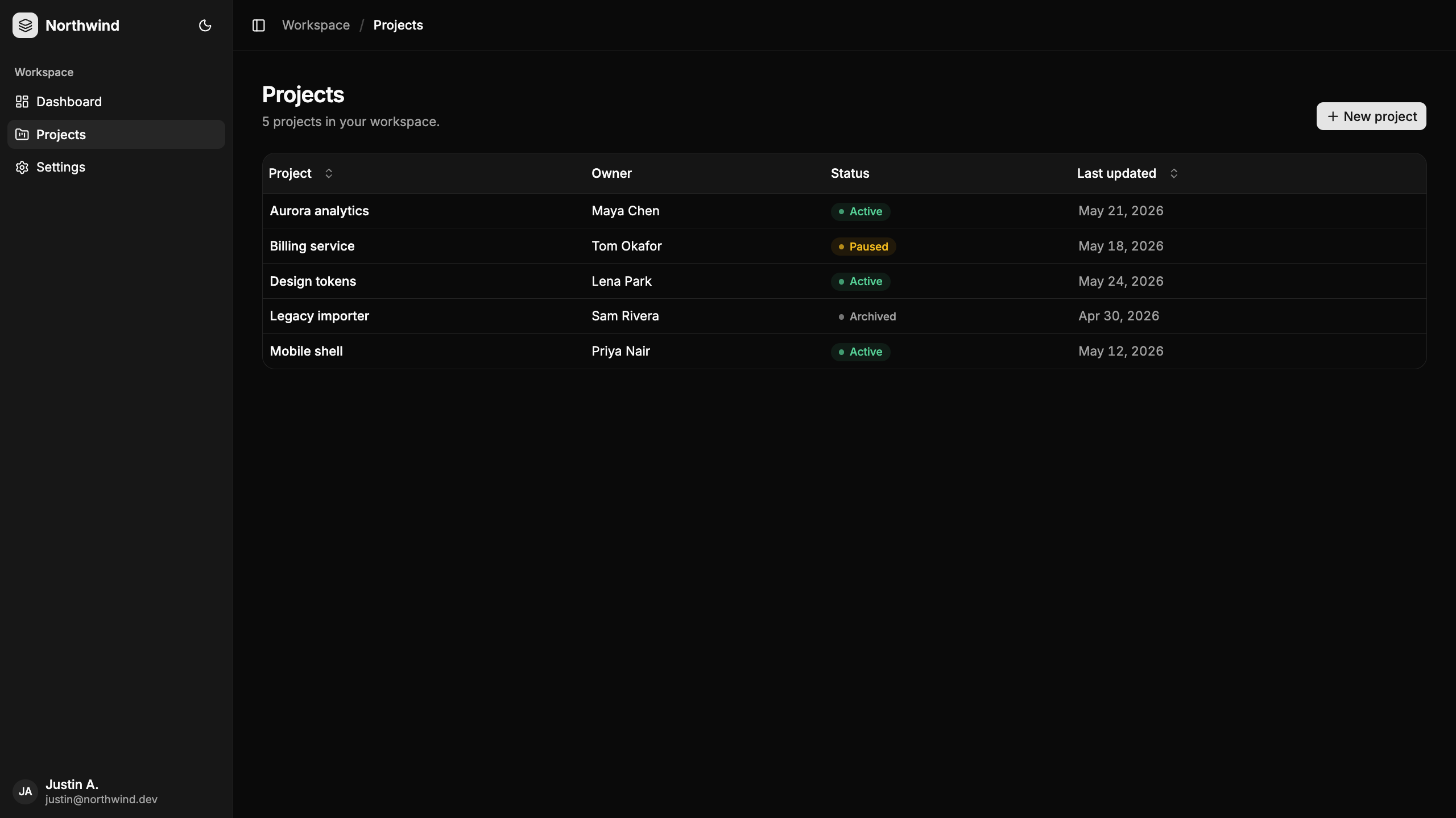
Those icons import from @lucide/svelte, the current package. If a tutorial tells you to install lucide-svelte, that is the old name.
The components you'll actually use
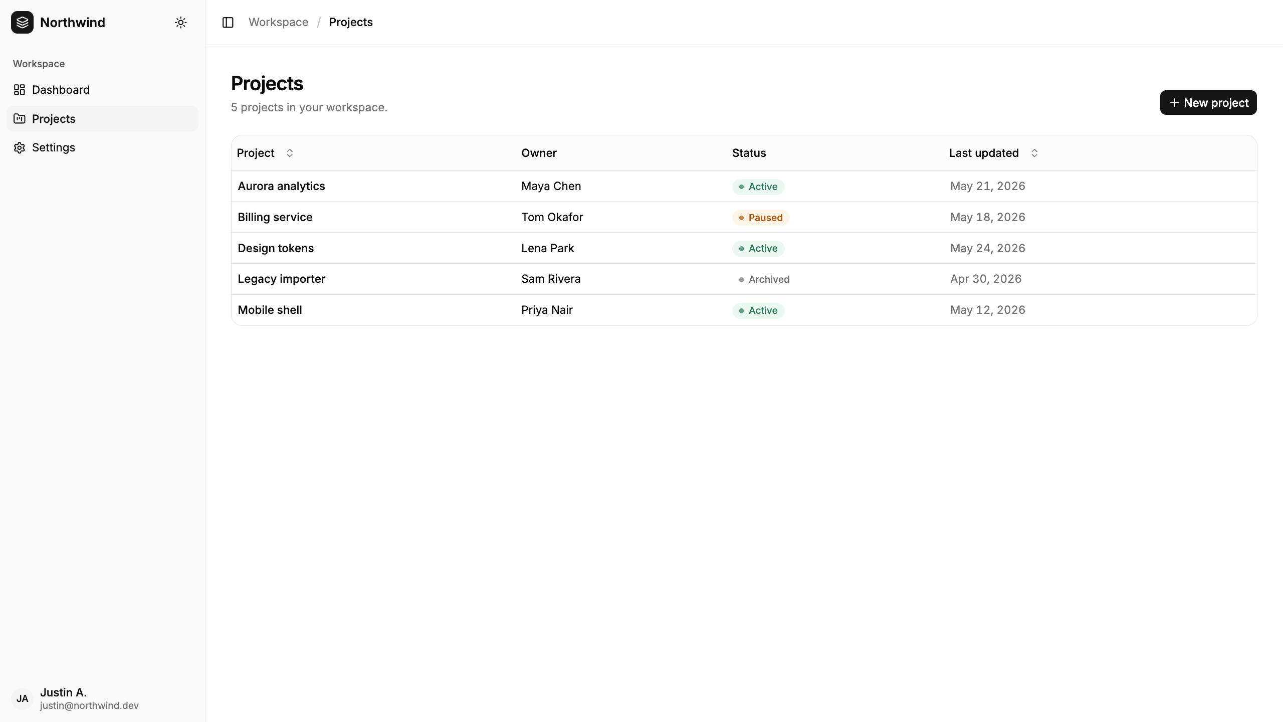
Setup done. Now the payoff. We'll build a projects dashboard: a sidebar shell wrapping a sortable table of projects. Two components carry most of the weight, the sidebar and the data table, so they are worth seeing in context rather than in isolation.
Sidebar
The sidebar component is really a kit. Adding it also pulls in a sheet for mobile, tooltips, and an is-mobile hook. You compose the pieces inside a Sidebar.Provider, which owns the open and collapsed state:
<script lang="ts">
	import FolderKanbanIcon from '@lucide/svelte/icons/folder-kanban';
	import * as Sidebar from '$lib/components/ui/sidebar/index.js';
</script>

<Sidebar.Root>
	<Sidebar.Content>
		<Sidebar.Menu>
			<Sidebar.MenuItem>
				<Sidebar.MenuButton isActive>
					{#snippet child({ props })}
						<a href="/projects" {...props}>
							<FolderKanbanIcon />
							<span>Projects</span>
						</a>
					{/snippet}
				</Sidebar.MenuButton>
			</Sidebar.MenuItem>
		</Sidebar.Menu>
	</Sidebar.Content>
</Sidebar.Root>
The child snippet is the pattern to learn here. Instead of Sidebar.MenuButton rendering its own <button>, it hands you its props and lets you render an <a>, so a nav link gets the button styling on the correct element. That snippet pattern is everywhere in Svelte 5; the snippets guide covers it if it is new to you.
You assemble the shell from three pieces. Sidebar.Provider wraps the layout and owns the collapsed state, Sidebar.Inset is the main area beside it, and Sidebar.Trigger toggles it, collapsing to a sheet on mobile for free:
<script lang="ts">
	import * as Sidebar from '$lib/components/ui/sidebar/index.js';
	import AppSidebar from './app-sidebar.svelte';
</script>

<Sidebar.Provider>
	<AppSidebar />
	<Sidebar.Inset>
		<header class="flex h-14 items-center gap-2 border-b px-4">
			<Sidebar.Trigger />
			<h1 class="text-sm font-medium">Projects</h1>
		</header>
		<main class="p-6"><!-- the projects table goes here --></main>
	</Sidebar.Inset>
</Sidebar.Provider>
Data table
shadcn-svelte's data table is not one component; it is the styled table plus TanStack Table for the logic. Install the core and the table helpers:
bun add -D @tanstack/table-core
bunx shadcn-svelte@latest add data-table
Define your columns once. renderComponent lets a cell render a Svelte component, such as a status badge:
// src/lib/components/projects/columns.ts
import type { ColumnDef } from '@tanstack/table-core';
import { renderComponent } from '$lib/components/ui/data-table/index.js';
import StatusBadge from './status-badge.svelte';
import type { Project } from '$lib/data/projects';

export const columns: ColumnDef<Project>[] = [
	{ accessorKey: 'name', header: 'Project' },
	{ accessorKey: 'owner', header: 'Owner' },
	{
		accessorKey: 'status',
		header: 'Status',
		cell: ({ row }) => renderComponent(StatusBadge, { status: row.original.status })
	}
];
The table wires those columns to your data with createSvelteTable, holding sort state in a rune:
<script lang="ts" generics="TData, TValue">
	import {
		type ColumnDef,
		type SortingState,
		getCoreRowModel,
		getSortedRowModel
	} from '@tanstack/table-core';
	import { createSvelteTable, FlexRender } from '$lib/components/ui/data-table/index.js';

	let { columns, data }: { columns: ColumnDef<TData, TValue>[]; data: TData[] } = $props();
	let sorting = $state<SortingState>([]);

	const table = createSvelteTable({
		get data() { return data; },
		get columns() { return columns; },
		state: { get sorting() { return sorting; } },
		onSortingChange: (u) => (sorting = typeof u === 'function' ? u(sorting) : u),
		getCoreRowModel: getCoreRowModel(),
		getSortedRowModel: getSortedRowModel()
	});
</script>
FlexRender then renders each header and cell, whether it is plain text, a sort button, or a component like the badge.
That status cell points at a small component of your own. Here it maps each status to a tone, the kind of touch owning the code makes trivial:
<script lang="ts">
	import { Badge } from '$lib/components/ui/badge/index.js';
	import type { ProjectStatus } from '$lib/data/projects';

	let { status }: { status: ProjectStatus } = $props();

	const tone: Record<ProjectStatus, string> = {
		active: 'bg-emerald-500/10 text-emerald-700 dark:text-emerald-400',
		paused: 'bg-amber-500/10 text-amber-700 dark:text-amber-400',
		archived: 'text-muted-foreground'
	};
</script>

<Badge variant="secondary" class="capitalize {tone[status]}">{status}</Badge>
The markup walks the header groups and rows, handing each to FlexRender. Put the empty state in the {:else} of the row loop, so a blank table still teaches instead of just sitting there:
<Table.Root>
	<Table.Header>
		{#each table.getHeaderGroups() as headerGroup (headerGroup.id)}
			<Table.Row>
				{#each headerGroup.headers as header (header.id)}
					<Table.Head>
						<FlexRender content={header.column.columnDef.header} context={header.getContext()} />
					</Table.Head>
				{/each}
			</Table.Row>
		{/each}
	</Table.Header>
	<Table.Body>
		{#each table.getRowModel().rows as row (row.id)}
			<Table.Row>
				{#each row.getVisibleCells() as cell (cell.id)}
					<Table.Cell>
						<FlexRender content={cell.column.columnDef.cell} context={cell.getContext()} />
					</Table.Cell>
				{/each}
			</Table.Row>
		{:else}
			<Table.Row>
				<Table.Cell colspan={columns.length} class="h-24 text-center text-muted-foreground">
					No projects yet.
				</Table.Cell>
			</Table.Row>
		{/each}
	</Table.Body>
</Table.Root>
The data table is a pattern, not a drop-in: you own the columns and the table shell, TanStack owns the sorting and rows. More wiring than a black-box grid, and far more control.
Building forms with Superforms
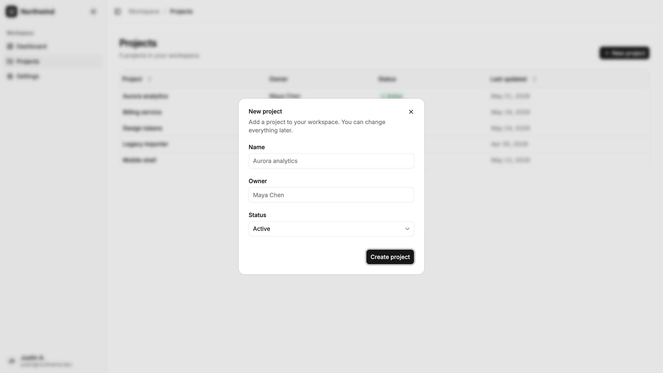
Forms lean on two more libraries: Superforms for validation and state, and Formsnap to bind shadcn-svelte form components to it. The "New project" dialog is a clean end-to-end example. Start with a schema. We use Zod 4, so the Superforms adapter is the zod4 variant:
// src/lib/schemas/project.ts
import { z } from 'zod';

export const newProjectSchema = z.object({
	name: z.string().min(2, 'Give the project a name.'),
	owner: z.string().min(2, 'Who owns this project?'),
	status: z.enum(['active', 'paused', 'archived']).default('active')
});
Load an empty form and handle the submit in a form action, the standard SvelteKit pattern:
// src/routes/+page.server.ts
import { fail } from '@sveltejs/kit';
import { message, superValidate } from 'sveltekit-superforms';
import { zod4 } from 'sveltekit-superforms/adapters';
import { newProjectSchema } from '$lib/schemas/project';

export const load = async () => ({
	form: await superValidate(zod4(newProjectSchema))
});

export const actions = {
	create: async ({ request }) => {
		const form = await superValidate(request, zod4(newProjectSchema));
		if (!form.valid) return fail(400, { form });
		// ...persist the project
		return message(form, `"${form.data.name}" created.`);
	}
};
On the client, superForm drives the form, and shadcn-svelte's Form.Control snippet hands you the props to spread onto the input, so labels, ids, and error wiring line up automatically:
<script lang="ts">
	import { superForm } from 'sveltekit-superforms';
	import { zod4Client } from 'sveltekit-superforms/adapters';
	import { toast } from 'svelte-sonner';
	import * as Form from '$lib/components/ui/form/index.js';
	import { Input } from '$lib/components/ui/input/index.js';
	import { newProjectSchema } from '$lib/schemas/project';

	let { data } = $props();

	const form = superForm(data.form, {
		validators: zod4Client(newProjectSchema),
		onUpdated: ({ form: f }) => f.valid && toast.success(f.message)
	});
	const { form: formData, enhance } = form;
</script>

<form method="POST" action="?/create" use:enhance>
	<Form.Field {form} name="name">
		<Form.Control>
			{#snippet children({ props })}
				<Form.Label>Name</Form.Label>
				<Input {...props} bind:value={$formData.name} />
			{/snippet}
		</Form.Control>
		<Form.FieldErrors />
	</Form.Field>
</form>
A Select field follows the same shape: the control props go on the trigger, and the value binds straight to the form store:
<Form.Field {form} name="status">
	<Form.Control>
		{#snippet children({ props })}
			<Form.Label>Status</Form.Label>
			<Select.Root type="single" bind:value={$formData.status} name={props.name}>
				<Select.Trigger {...props} class="capitalize">{$formData.status}</Select.Trigger>
				<Select.Content>
					{#each ['active', 'paused', 'archived'] as status (status)}
						<Select.Item value={status} class="capitalize">{status}</Select.Item>
					{/each}
				</Select.Content>
			</Select.Root>
		{/snippet}
	</Form.Control>
	<Form.FieldErrors />
</Form.Field>
Drop the whole form inside a Dialog, drive its open state with a $state boolean, and close it from onUpdated when the submit succeeds, the same hook that fires the toast.
The same schema validates on the server and the client, and svelte-sonner's toast confirms the result, wired through onUpdated rather than scattered across handlers.
Is shadcn-svelte compatible with Svelte 5?
Yes — and this trips people up because of timing. shadcn-svelte was ported to Svelte 5 and runes; the components ship as runes-native files using $props, snippets, and onclick (not on:click). The confusion in old forum threads dates from the migration window, which closed long ago.
If you are new to runes, the Svelte 5 runes guide covers the syntax you will see throughout the generated code.
Current shadcn-svelte is Svelte 5-native. If a thread says otherwise, check its date.
Common pitfalls
A few traps come up again and again. None are hard once you have seen them.
Editing tailwind.config.js
There is no config file to edit. That is a Tailwind 3 habit. Add design tokens with @theme and plugins with @plugin, both in your CSS.
The dark-mode flash
If the page flickers from light to dark on load, you mounted the toggle but left ModeWatcher out of the root layout, or put theme logic in onMount. ModeWatcher is the piece that runs before paint.
Installing lucide-svelte
The icon package is @lucide/svelte now. The older lucide-svelte still resolves, but the generated components import from the scoped package, so match it to avoid shipping two icon libraries.
Expecting components to update themselves
npm update will not touch your components; they are your files, not a dependency. Re-run shadcn-svelte add <name> to pull upstream changes, then reconcile them with your edits.
Is shadcn-svelte right for you?
It depends on how much control you want. The owned-code model is both the strength and the cost:
Choose shadcn-svelte when you want to customize deeply, keep your dependency surface small, and treat the components as your own code.
Choose Flowbite or Skeleton when you would rather import finished components and update them with a package bump.
Choose daisyUI when you mostly want Tailwind class-based styling without owning the component logic.
The honest tradeoff: because you own the files, there is no npm update for them. When upstream fixes a bug, you re-run add for that component and reconcile your changes. For a design system you are actively shaping, that is a feature. For a project you want to set and forget, it is friction.
Own the code when you plan to change it. If you will not, a conventional library is less work.
Wrapping up
shadcn-svelte trades the convenience of a packaged library for something more valuable on a project you will live in: components that are yours to read and reshape. Set up the CLI once, theme at the token layer, and the rest is composition.
Next, make the dashboard's data real by wiring the projects table to a database with the SvelteKit, SQLite, and Drizzle guide.
Happy coding!